Retention Marketing
Cohort Analysis for DTC Brands: Where LTV Dies Between Orders 2 and 4

Written by
10 min read
Sep 4, 2026

CFO meetings look pretty different these days. Remember when you could justify your marketing budget just by pointing to blended ROAS and a nice growth number? Fast forward to 2026, and the conversation is all about incrementality.
Now, you need to know exactly what each customer cohort costs, what they’ve brought in so far, and when you’ll actually break even. A lot of CMOs still show up with a blended LTV and a payback chart that seems convincing on a slide, but it usually falls apart as soon as someone asks a follow-up question.
The real issue isn’t the reporting itself. The problem is that a blended average paints a picture of a customer base that doesn’t actually exist. That’s where cohort analysis comes in. It can give you a much clearer view, but only if you set it up correctly.
Here’s a real-world example: ecommerce brands lost an average of $29 on every new customer they acquired in 2022. That’s a huge jump from just $9 in 2013, according to SimplicityDX. If you’re losing money on the first order by default, your entire business depends on getting those second, third, and fourth purchases.
What is cohort analysis?
Cohort analysis is all about grouping customers who have something in common at the start, and then tracking how each group behaves over time.
Think of it as comparing apples to apples, instead of just lumping everyone together and hoping for the best. This approach helps you answer a question that averages simply can't: are you actually getting better at keeping the customers you worked so hard to acquire, or is there room for improvement?
In most cases, cohort analysis is done by grouping customers based on the month they first bought from you. So, everyone who made their first purchase in January is one cohort; February buyers are another; and so on.
Then you track how many people from each group are still coming back in month two, month three, and month six, and beyond. When you lay out these numbers in a table, you get that classic triangle chart you might have seen before.
This is super useful because it lets you spot trends you’d otherwise miss. For example, you might see that your March cohort isn’t sticking around as well as your January cohort. If you just looked at the overall average, you’d never catch that difference.
Quick note, since these two terms often get mixed up: cohort analysis is the method, while customer lifetime value (CLV) is just one of the things you can figure out using it.
Why do DTC brands need order-indexed cohorts, not monthly ones?
As we saw in the previous topic, monthly cohort analysis shows you when customers stopped buying, but order-indexed cohorts reveal at which purchase number they dropped off. This difference matters because, in DTC, most of the ways you can influence customer behavior are tied to specific orders, not to the month on the calendar. So if you want to actually do something about retention, you need to know which order is the sticking point.
Think about what you can actually do with the data. If your monthly retention cohort tells you that customers who joined in March are 4 percentage points lower than those from January by month five, you know there’s a problem, but you have no idea where it’s happening. Those March customers could be at any stage.
When you look at retention by order number instead, things get much clearer. For example, you might see that 41% of customers who make a second purchase go on to make a third, but only 26% make it from the third to the fourth order. Now you know exactly where customers are dropping off, so you can target your retention efforts at the right stage and assign the right team or program to own that transition
Table 1. A cohort retention analysis answers a different question depending on what you index.
Indexed by | The question it answers | What you can do with the answer |
|---|---|---|
Time (acquisition month) | Is the business getting better or worse at retaining customers over calendar time? | Diagnose seasonality, judge whether recent acquisition quality is drifting, compare year over year. |
Order (purchase number) | At which purchase does repeat buying break down? | Attach a specific intervention to a specific transition: offer, lifecycle flow, subscription routing, loyalty tier. |
Both views are legitimate, and a mature team runs both.
Read also: 12 Customer Retention Metrics Every DTC Brand Should Know
What does a cohort-level interrogation actually reveal?
You’ll quickly see that your blended average is just sitting in the middle of two groups of customers who act completely differently. To really understand what’s going on, let’s look at the model with all the numbers out in the open. That way, you can follow along and check the math for yourself.
Let’s use an example. Imagine a brand bringing in 10,000 new customers every month. Each customer spends about $75 per order, the gross margin is 60%, and the blended customer acquisition cost (CAC) is $60. On average, each customer places four orders, totaling a $300 lifetime value (LTV). At first glance, this looks like a solid business.
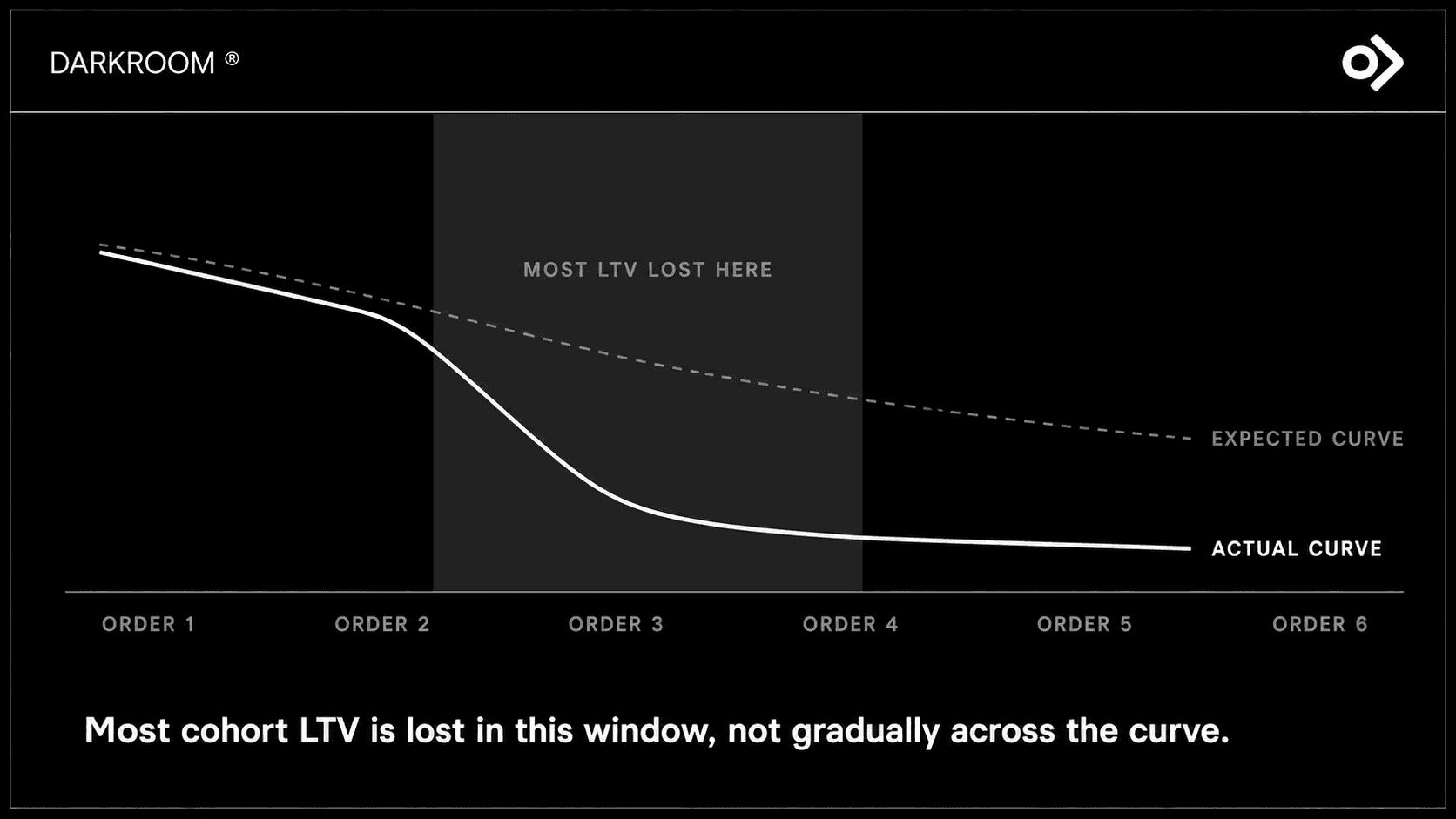
But here’s where it gets interesting. If you break down the data, that average starts to fall apart. Customers who make it past their third order usually place six or more orders and drive most of your profit. On the other hand, customers who drop off between their second and fourth orders average only about 1.5 to 2 orders and often never recoup the $60 it costs to bring them in.
Table 2: Darkroom model. Example of cohort profit at four repeat-rate scenarios. Inputs: 10,000 new customers per month, $75 AOV, 60% gross margin, $60 CAC.
Scenario | LTV per customer | Gross profit per customer (60%) | Net profit after $60 CAC | Total cohort profit | Incremental |
|---|---|---|---|---|---|
Baseline | $300 | $180 | $120 | $1.20M | n/a |
+5 points | $322 | $193 | $133 | $1.33M | +$130K |
+10 points | $333 | $200 | $140 | $1.40M | +$200K |
+15 points | $345 | $207 | $147 | $1.47M | +$270K |
Profit moves faster than LTV. A $22 lift is about 7%, but it produces roughly an 11% rise in net profit per customer, because CAC is fixed at acquisition. You have already paid the $60. Every additional order arrives at near-pure contribution margin, with no acquisition cost left to amortize.
This is a model and should be read as one. The 5 to 15 point range is directional, and the exact leverage point varies by business, so run it on your own inputs first. What does not vary is the shape: across twelve cohorts a year, that band is $1.6M to $3.2M in incremental annual contribution margin, on the same acquisition budget.
The inputs are ones you already report: repeat purchase rate at each transition, gross margin by SKU, blended CAC.
Why does acquisition create the cliff?
The drop-off in repeat purchases doesn't actually begin after the second order. It starts much earlier, right in the acquisition funnel. Sometimes, the very tactics that help us win new customers are the same ones that bring in people who were never likely to stick around in the first place.
Let’s start with discount anchoring. Imagine someone’s first purchase is thanks to a big 40% off welcome offer. They’re not really buying into the product at full price. So when they see the usual 10-15% subscriber discount later, it doesn’t feel like a perk. Instead, it feels like a letdown compared to the huge discount that got them in the door.
Another reason is that the first delivery often doesn’t become part of the customer’s routine. Maybe they try the product once, then it just sits on the counter. They’re not upset enough to reach out or leave a review, but they also don’t become regular users. This means any small issues that loyal customers might notice and report never even make it to your team.
Then there’s the SKU mix. A lot of brands use their hero product to attract new customers because it’s the easiest to sell. But here’s the catch: that hero SKU often has the lowest reorder rate in the whole catalog. So the ad that brings in the most customers might actually be setting you up for the worst repeat purchase rates, and you won’t see that in your acquisition dashboard.
From an acquisition perspective, none of this looks like a problem. The team hits their cost-per-acquisition targets, and on paper, everything looks great. But what actually happens is that retention ends up with customers who were never likely to return.
That’s why the idea that retention is cheaper than acquisition often sounds good in theory, but doesn’t work out in practice unless you’re bringing in the right kind of customers from the start.
How do you run a cohort analysis on your own data?
A customer cohort analysis has four steps, and the constraint is never the analysis itself. It is the joins. Cohort analysis for ecommerce spans four systems bought separately that share no customer key.
Define the cohort. Group by acquisition month, then index the axis by order number rather than elapsed time. Hold first-order channel, discount depth, and entry SKU as attributes on the customer record, not as separate cohorts. Splitting them out this early fragments the sample.
Join the data. This is where the work is, and why so few brands have this view.
Read the curve: Plot the survival rate at each individual transition, not the cumulative retention rate. Cumulative curves decay smoothly by construction and hide the thing you are looking for.
Layer the attributes: Split the curve by acquisition channel, then discount depth, then entry SKU. This is where the answer usually is, and it is usually uncomfortable: one channel or one welcome offer is producing most of the stall.
Table 3: Where the data lives. The joins required for an order-indexed cohort view.
What you need to know | Where it lives | Join key | What breaks |
|---|---|---|---|
Order index, AOV, entry SKU, discount depth | Ecommerce platform (Shopify, commercetools) | Customer ID | Guest checkout and email changes split one human into multiple customer records, inflating your new-customer count. |
Send, open and click history by lifecycle stage | ESP or CRM (Klaviyo, Attentive) | Email or phone, hashed | Profiles created via a popup before any purchase have no order history, so engagement appears decoupled from revenue. |
Billing sequence, skips, cancellations | Subscription platform (Recharge, Skio) | Subscription ID to customer ID | Billing number and order index diverge the moment a customer skips, and most reporting silently treats them as the same thing. |
Tier, points balance, redemption history | Loyalty platform | Customer ID or email | Tier is usually stored as a current-state value with no history, so you cannot reconstruct what tier the customer held at order three. |
This is longitudinal work, and it complements snapshot segmentation. RFM analysis tells you who is valuable right now; a cohort curve tells you what happens to a group over its lifetime. Run both.
Which order transition holds the leverage?
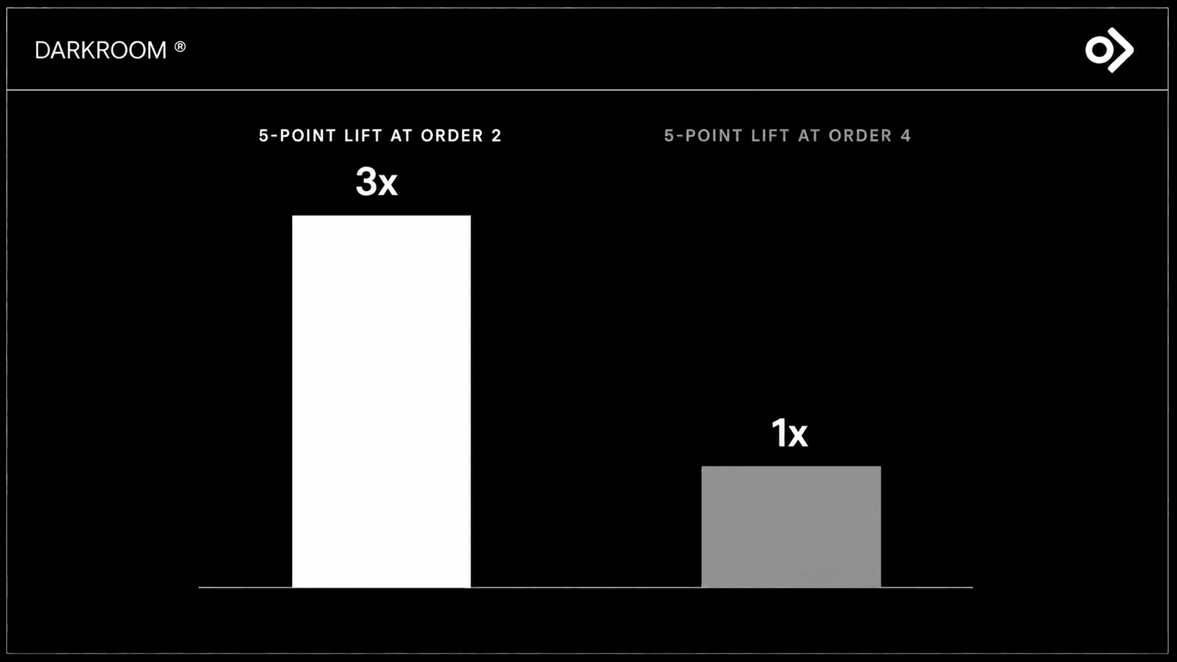
Here’s something worth bringing to your next budget meeting: not every order transition is created equal. For example, if you can boost the conversion rate by 5 points at the second order, you’ll usually see about three times the profit impact compared to making that same improvement at the fourth order.
Why is that? There are two big reasons:
Far more customers are in those early stages, so small changes there affect far more people.
The difference between a customer who keeps going and one who stops is much bigger early on.
If someone drops off after their second order, they probably haven’t paid back what you spent to acquire them. But if they make it to the fourth order, chances are you’ve already covered your acquisition costs.
This difference is exactly why focusing on the right sequence matters more than just working harder. Most teams put their energy into the transitions they can easily spot, like those loyalty milestones later on. But the real leverage is actually a couple of orders earlier.
Five interventions that bend the retention curve in your cohort analysis
Knowing exactly where your customers drop off is only half the battle; the real work lies in the interventions you apply to those specific transitions.Here are five practical ways to influence customer behavior at the most critical points in their journey.
1. Engineer the loyalty program around the cliff
Tie tiers to purchase count rather than dollar thresholds: gold at four orders, platinum at eight. That puts the reward where the retention decision is made, not at the spend level a discount shopper reaches in a single basket. Then make progress visible with tier triggers, expiring-credit warnings, and a persistent balance bar on sends.
Read also: Why Loyalty Programs Fail Without Retention Infrastructure
2. Replace manual cross-sell with predictive cross-sell
Most post-purchase cross-sell modules were designed once, in a meeting, over a year ago, and have run unchanged through launches, discontinuations, and real shifts in behavior. That is not strategy; it is a frozen guess nobody is questioning. Market-basket modeling against the live catalog updates the recommendation as the catalog moves.
3. Build two lifecycle programs
In replenishable categories, you do not have a customer until the second purchase. Coffee pods, refillable skincare, razor cartridges and cleaning concentrates share this shape. The starter-but-no-refill cohort and the refill loyalists have different economics, objectives and timing, and one program serves both badly.
4. Route each customer between subscription and reorder on behavior
Not every customer should be pushed to subscribe. Some buy on an irregular cycle and cancel within two billings, converting a good reorder customer into a churn statistic. The signal is in the data you have: purchase interval regularity, category, basket composition.
5. Stop front-loading the subscription discount
The problem is not the standing 10 to 15% subscriber rate. It is the delta from 30% to 50% on the welcome offer that acquired the customer. Collapsing from one to the other after a single order reads as a price rise at the moment the customer is deciding whether this is a habit.
Taper instead, across the first two to four billings: 30, then 25, then 20, then 15. The prerequisite is knowing what you can afford by SKU and cohort, which is the margin data the model above runs on. It also removes a loud trigger for voluntary subscription churn.
Why most in-house lifecycle teams cannot close this alone
If you’re a retention manager, you probably know how easy it is to get buried by the marketing calendar. There’s always another campaign to plan, and deep dives like cohort analysis often get pushed aside because they don’t lead to an immediate send.
On top of that, your data is probably scattered across several platforms that don’t connect, so you need both marketing know-how and data engineering skills just to make sense of it all. And when it comes time to actually run segmented campaigns, it can feel like there’s just not enough hours in the day for one person to handle it all.
That’s exactly where a specialist retention marketing agency comes in. For example, at Darkroom, we treat cohort analysis as a regular part of how we operate, not just something we do once a quarter. Plus, things like predictive cross-sell and behavior-based routing aren’t just buzzwords for us, as they’re already up and running in our clients’ programs.
When it comes down to it, buyers and boards are really focused on three key numbers: retention, LTV to CAC ratio, and the quality of growth. And all of these depend on what happens after that initial customer acquisition push.
Run the diagnostic on your own cohort data
The five questions above are the whole test. If your team can answer all five from your current stack this week, you have the diagnostic instrument and the work is prioritization. If you cannot, the gap is infrastructure rather than analysis, and every month without it is another cohort acquired on assumptions you cannot check.
We will run the diagnosis with you. Book a free retention audit, and we will build the order-indexed curve on your data, identify which transition holds your leverage, and quantify what a 5 to 15 point lift is worth against your margins. You keep the model either way.